Drag
UI/UX · Dec 2022 · 11 MIN READ
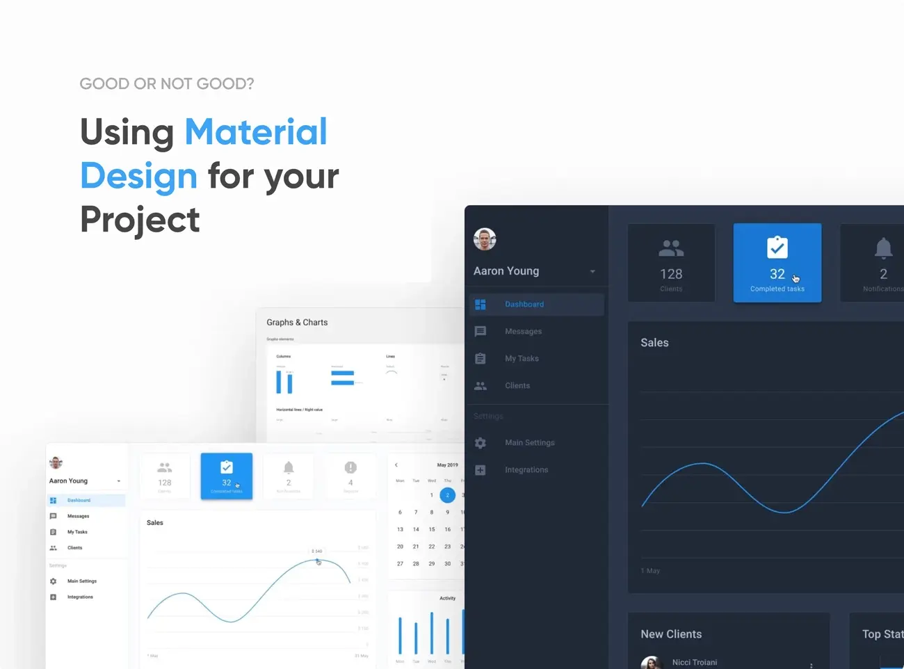
How to use Material Design in next project?
Want to quickly build beautiful usable apps across platforms? If you’ve heard the term user experience design and been overwhelmed by all the jargon, then you’re not alone. In fact, most practicing UX designers struggle to explain what they do!

Introduction to Material Design
Material Design is a flexible design system that utilizes open-source code to assist teams in creating high-quality digital experiences quickly and easily. From design principles to developer tools, Material Design can help accelerate your product development. Developed by Google in mid-2014, Material Design was originally called “Quantum Paper” and aims to bring a fresh, “ink and pen” approach to design. Its release made a significant impact on the design community, not just for Android development, but also for iOS apps and websites.The goal of Material Design is to provide a consistent, high-quality user experience across different devices, platforms, and input methods. By mimicking real-world objects and interactions, Material Design aims to reduce cognitive load and increase predictability for users. The “card” concept serves as a foundation for layering elements and animations, allowing for a more personalized experience.Similar to how Apple adopted the flat design as its standard, Google implemented Material Design to ensure a consistent user experience across all of its products. However, Material Design is more comprehensive than most design systems as it was not created for a single brand or project, but for use across multiple platforms and products.
The Evolution of Design
Material Design, the standard for designing and creating websites and apps, aims to bring order and unity to web design as a response to outdated, user-unfriendly, and chaotic styles. Many changes have occurred to design since its creation, beginning with a Wild West of design in the 1990s and early 2000s that eventually gave way to simpler, cleaner, and more predictable websites. Then, with the emergence of smartphones, significant changes were needed, resulting in a seismic shift in the way apps and websites were designed, thanks to Google's design system and language, Material Design.Material Design guidelines provide best practices and user interface design, and within them, you'll find the building blocks of usability and functionality - the components. Each component page includes guidance on usage, interaction patterns, and design specs to ensure you get it right. The material also offers resources and tools to streamline your workflow. In 2018, Google detailed a revamp of the language, focusing on providing more flexibility for custom “themes” with varying geometry, colors, and typography, and a Theme Editor to create a branded, simple library for building beautiful UI.The Material Design specification covers everything from typography to grids, space, scale, color, and imagery, but it goes further than just telling designers how to make things look. It empowers designers to create intentional designs with hierarchy, meaning, and focus on the final result.

The Rise of Material Design
It was around 2010 when skeuomorphism rose to fame. This was a design style that made UI elements resemble the actual objects they were modeled after. Many app icons on the iPad at that time were skeuomorphic; for example, the Camera app's icon resembled a camera lens, the Clock app's icon resembled an old analog clock, and the Calendar app's icon resembled a flip calendar card. However, these skeuomorphic UIs ended up being too distracting due to their realistic qualities, and the realism was not used for any purpose other than to be trendy.The next design trend, flat design, aimed to eliminate excess and superficiality from the previous trend. These icons, as well as icons for many long-standing apps, became flat and lost most of their realistic qualities. While flat design continues to be popular today - since minimalism and clean design never go out of style - there was a major drawback that needed to be addressed.Material Design was inspired by the physical world, but this was not an attempt to bring design back to the skeuomorphic days. It was a metaphor (which will be explored further when we examine its principles). What Material Design really did was move away from designing completely flat UIs to designing surfaces that were inspired by paper and ink. Imagine this: when viewed straight on, a sheet of paper appears flat and two-dimensional, but in the real world, it does not behave that way. Paper exists in three dimensions and creates shadows, seams, and folds that can be cut and resized for our needs - something that Google aimed to replicate in the digital space with Material Design.Therefore, Material Design still uses flat elements, but these elements sit on various planes and can behave like paper and other objects in the real world, giving digital experiences a more lifelike “feel.” This allows users of apps or websites to interact with the UI more naturally, as they understand how to touch and move around objects just as they would in the physical world.

Understanding the principles of Material Design
Material Design is about more than just adding layers or shadows to design. It’s a super-comprehensive resource that sets the rules for a new design language. Similar to how we have basic principles we need to follow in web design, Material Design has three principles of its own:Principle #1: Material Is a Metaphor
Think of Material Design as the digitization of the physical world. So, rather than ask visitors and users to enter a digital experience that feels unnatural to them, Material Design applies the basic principles of our physical environment to apps and websites. Our on-screen design should be a metaphor for off-screen things, especially pen and paper. This means that on-screen buttons should look like real-life buttons, elements should have shadows, and “the fundamentals of light, surface, and movement” need to be respected. For example, a pop-up ad – should have a subtle shadow, because all 3D objects have shadows.Principle #2: Bold, Graphic, Intentional
Everything that we design should be deliberate and big. No more wishy-washy colors like beige. The takeaway here is that material design aims to guide designs that make sense straight away, are easy to follow (e.g. bold colors, headlines), and create a clear and uncluttered experience (for example, with negative space). Each section breaks down how the component works and why it needs to work that way. Essentially, there’s meaning and logic behind every design choice. This was a significant change in design at the time. No longer was it about designing something because someone liked how it looked or because it followed a certain trend. Material Design also explained how exactly (and why) to design them in a certain way to create a user-first experience. In the beginning, Material Design heavily focused on grid-based design, clear typographic hierarchy, bold color palettes, and meaningful animation (among other things).Principle #3: Motion Provides Meaning
Motion can be used to help move the user and create meaning, in particular, movement is especially useful in providing feedback to the user. For example, on Android, when you hold down an icon, it pops out a little to tell you that it’s ready to be moved. That small movement is a great way to communicate with the user. That’s what material design aims for. Motion design doesn’t have anything to do with animation for the sake of animation. Like with everything else with Material Design, it’s meant to make the design more intentional and the user experience more intuitive. Entire interstitials can be animated, too. For instance, while users wait for a new screen to open. It really all depends on if motion is needed to inform, focus, or express at that point along the user journey.

Material Design 2.0
In May 2018, Google released a revised version that fixes major issues. The original guidelines were restrictive and emphasized function over style. Many app makers hated Material Design because the apps built according to them were similar. After backlash from the design community, Google unofficially released his Material Design 2.0 in 2018. Version 2 includes not only new guidelines, but also a set of tools (including a new icon pack and material design editor) that you can use to customize your design. After this overhaul, Google started redesigning most of the apps into customized and adapted new version.White space is emphasized, a bottom navigation bar is used, a colorful icon set is added, and a dark mode is also available. In addition, web accessibility and internationalization are also very important. Sure, design systems and guidelines still exist, but there are now countless resources for designers to pick and choose useful parts of the system to suit their own purposes.Designers have access to starter her kits and tools such as:Icon sets, Google fonts, Adobe design kits, Sketch and Figma, Material Design templates... you'll also find design customizer tools here to help you stick to design best practices while maintaining your UI. Add your own creative branding touch.At Google I/O in May 2021, Google announced a new concept for Android 12 called Material You (Material Design 3). This includes more animations, larger buttons, and custom UI design highlights that are generated from the user's background image. Material You was gradually rolled out to various Google apps on older versions of Android over the next few months and served as the main focus of the Pixel 6 and Pixel 6 Pro smartphone series.
Material Design 3.0
Google revealed in late October that Material Design 3 would be a complete overhaul of its design language after the launch of Android 12 in May 2021. The expanded color scheme in Material Design 3, also known as Material You, makes use of features like dynamic color. To change your palettes, just drop the Android XML or Compose theme code into Material Theme Builder.Google wants to support all designers in “creating designs that are personal for every style, accessible for every need, alive and adaptive for every screen” with Material You and rekindle enthusiasm and creativity for Android apps. Apps and widgets can now be modified based on the color schemes of users wallpapers. This strategy is particularly clever because it doesn't call for users to exert any additional effort since the majority of us already personalize our wallpaper. By giving users more control over the contrast, size, and spacing settings, Material You also makes it simpler for designers to create responsive and accessible apps. Let's look more closely.UI Components also received a style update. In general, Material Design 3 adopts a more straightforward, fun appearance. It has elements that are more rounded, shadows that are lighter, more white space, and new active states that are all compatible with dynamic colors. As an illustration, the navigation bar, which was formerly referred to as the bottom navigation, has grown taller and no longer casts a shadow.Design tokens are a new Material tool intended to enhance consistency and collaboration among design teams. They are a somewhat less well-known novelty. But for large teams working on numerous intricate app builds, their time-saving potential is enormous. Tokens contain dynamic style values that can be changed across the entire project at once, including colors, typefaces, measurements, and even other tokens. They enable teams to control styles during the design and implementation phases across all platforms (not just Android) from a single location.However, there are still a lot of unanswered questions, such as how many brands will be willing to adopt Material Design 3's personalized approach when doing so implies letting go of some design control. How will designers feel about fusing branded and personalized color schemes, and how will we all work to ensure that each of our apps maintains its own identity?

Finalizing the Debate on Material Design
Like its predecessors, Material Design was found to have a significant flaw that needed addressing. It was too rigid, with everything spelled out for designers, making it feel like “This is how you do good design. Follow my lead.” It's important to note that there is nothing wrong with working from templates or components, but the issue with Material Design was that everyone was working from the same design system and rules. Despite its comprehensiveness and documentation, Material Design remains a relatively flexible design library. The specifics of how to implement the design are left to the designer's discretion within the guidelines.While Material Design has clear advantages, it also has its drawbacks. It is easily recognizable and closely associated with Google and specifically Android. This may not be an issue for everyone, but it could be a negative for some.Beginners may find the Material Design specification more complicated and harder to implement compared to other styles like flat design. Due to the comprehensiveness of the Material Design system, there are many more considerations and guidelines to adhere to than some new designers may be comfortable with.Its comprehensiveness can also lead to some designers feeling restricted and unable to fully express their creativity. It can also stifle innovation, as virtually any design challenge has been planned for and solutions offered. While helpful in many cases, this can prevent designers from taking new approaches to problems and limit the number of new ideas that may arise.The most important thing is to not rely on Material Design in all projects. Carefully evaluate when it is an advantage and when it is not, and you will get the most out of it.
“It’s vital for Material Design to meet users’ expectations of how components should behave. For instance, onscreen objects are more credible if they follow the laws of gravity. ”

Matias Duarte
VP of Material Design at Google